Introduction to graph-based analytics using Cylynx Motif

I am a Data Engineer I love Python! I am based in Singapore I have good knowledge on cloud I have some knowledge on building Machine Learning Models I have helped 30+ companies use data effectively I have worked with Petabytes scale of data I write @ TowardsDataScience Nowadays I am focusing on learning Natural Language Processing Ask me about anything, I'll be happy to help.
Data visualization and analysis may help you find summary data, complexity, unseen connections, patterns, differences, irregularities, and insights in your dataset. Although there are several technologies available to help in the presentation of tabular information, this can be true with graph data.
The motif is one of the no-code graph visualization tools. This software will assist researchers, data analysts, and executives in establishing the links between their datasets and making graph analysis more simple and interesting!
In this article, we will discuss graph-based analytics using Cylynx Motif, challenges of graph data exploration, and motif graph intelligence platform. Keep scrolling to read more.
What is Graph-Based Analytics?

It is a fast-growing field of study in which graph-theoretic, analytical, and database approaches are used to describe, save, extract, and execute performance evaluations on graph-structured information.
Analysts can use these methods to figure out how a network's framework changes under various circumstances, discover pathways between combinations of entities that fulfill distinct limitations. These are also used to recognize clumps or carefully interacting subsets within a graph and discover subgraphs that seem to be comparable to a data set.
It is necessary to visualize one's information as a graph of nodes or vertices that indicate items and connections that reflect connections between things for this and several other activities. Several technology fields, like sensing devices, need huge graphs with billions of nodes and edges.
These could indicate a thousand different sorts of things and connections in activities like situation monitoring. The interconnections in telecommunication systems could change over time, and certain organizations might be quite closely linked to one another.
- Financial services
GA for financial sectors is a compelling technique for visualizing networks, connections, and activities between individuals, companies, and things. The most well-known applications of GA so far have been in the analysis of social media information.
However, the system can potentially change the financial solutions sector, particularly once used to reinforce Artificial Intelligence (AI)-based metrics, like trying to stabilize different processes or reducing time-consuming actions like information processing, verification, and error adjustment.
Financial Institutions (FIs) may obtain priceless – and quick – information into their networks (through cybersecurity threat control), counterparties (through counterparty credit threat), users (mostly through KYC/ AML), as well as the broader community by implementing GA successfully (via supply chain analysis).
GA does have a big future. It's feasible to build an AI tool that can either automate choices or enhance and boost rational decisions by integrating it with other scientific approaches. Machine Learning (ML) approaches have recently received a lot of attention in cutting-edge analyses, and GA may have a similar impact on finance and safety innovation.
- Supply chain management
We can save cash on shipments by using the supply chain management graph. That form of the graph may help you utilize economies of scaling, particularly if you have a broader perspective of consumption, how everything relates to your stock, as well as how much you'll have to purchase in a given timeframe.
Perhaps you're now placing smaller, more frequent orders since you’re unable to implement this long-term strategy throughout the entire supply chain. If you've got a broader perspective (that the graph may assist you to see), you could purchase in large quantities, make more informed purchasing choices, and save cash.
You may also use the graph to improve your inventories. You could then shift your stock around so it's in the appropriate location at the proper moment after you realize how many usable components you need, wherever those are, how much time will need need to bring them to business, and also what transportation they'll have to travel in (in regards of your prediction).
Instead of completing new purchases and keeping your stock untouched, you may use this to stay profitable. This might help you fine-tune your stock management so you don't have as much on the store. And besides, you know how your prediction will come out in perspective of how many components you'll require. Then you'll be able to efficiently arrange your inventories and avoid buying or storing more than you'll need.
The graph can assist you in comparing and contrasting providers and related items. You may analyze customer complaints and evaluate the process variation from different vendors once you have that picture of the providers versus all the parts and materials you're utilizing.
- Customer 360
By looking at the graph, you can see how this user is related to certain other businesses; for instance, consumers could operate in any of your other business companies, or maybe they're friends and family. You got contract details, and you can access not only details regarding their existing vehicles - its actual BOM, how it's maintained, choices available, product definition, and many more – but also any other cars they've manufactured.
You can also examine the cars they've bought in the past, as well as the choices and requests they've made. Sensor information, telemetry statistics, billing information, and any customer encounters may all be included in this graph.
About the Motif Graph Intelligence Platform
What is Motif?
The motif is a graph analytics application that converts linked information into business information without the use of programming. It allows users to accelerate information mining, research, and interaction by allowing companies to make the connections between disparate data sets. Researchers, business analysts, and executives may use Motif to do a graphical search on graph information.
What was the motivation for developing Motif?
Motif wants to reduce the access restrictions for anybody interested in graph issues. One of the major issues encountered was that integrating graph data into corporate decision-making in sectors such as financing and known security vulnerabilities.
The majority of options are custom-built, private, time-consuming, and costly. Cylynx is trying to fix that with Motif, which makes 80 percent of the most widespread networking visualization use scenarios as simple as possible while also adding interactive functionalities to turn graph data into business insight.
A Simple Tutorial to get started with Motif (using movie dataset)
If you interested in a comprehensive tutorial, check out this video on my youtube channel
Steps
- To get started go to the following Demo Motif Link
- As a first step you would need to import the data, click on the import data button. There are various ways you can start with the data.
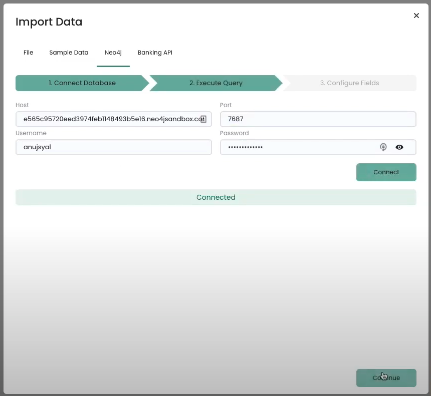
Information about the dataset: In this tutorial, I will use a neo4j graph database server sample
Movie Dataset. And connect directly using the server URL and credentials. To create a similar dataset, go to ne4j sandbox . After you log in, you can create a new database server withMovie Datasetpreloaded, please note it will expire in 3 days.After the server is connected, you would a query to extract this data. I am using a query that extracts information on movies and the corresponding actors. Click on execute query and import the nodes and edges.
MATCH (p:Person)-[r:ACTED_IN]->(m:Movie) RETURN p,r,m
- After the data has been imported you will see the graph with all the nodes and edges populated in the visual interface
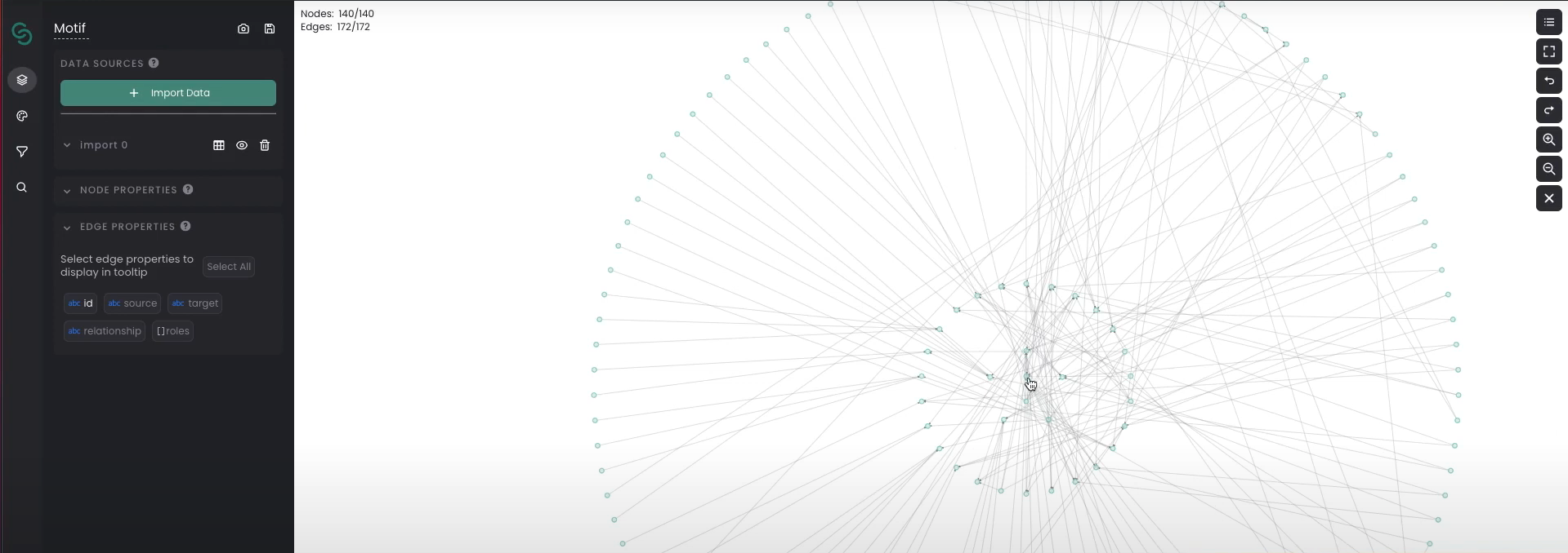
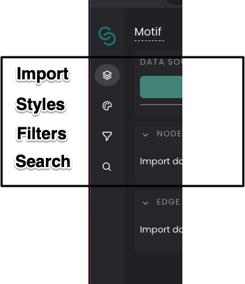
- On the right, there are quick action buttons like zoom-in, zoom-out, undo, redo, etc. On the left there is a control panel with the following options
- The idea of using Motif-like tool for graph-based analytics is to explore the data and relationships visually. That is where the
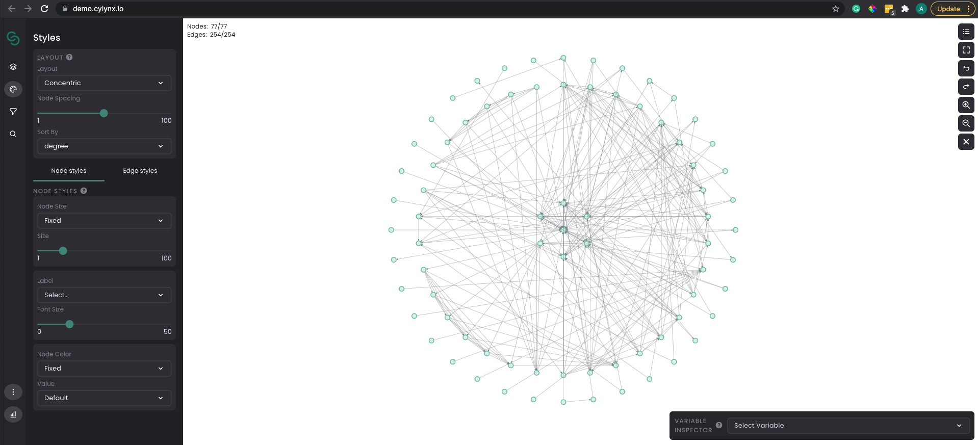
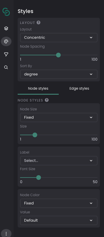
Stylestab helps you with in depth exploration. You should be able to select different layout options, radius, node spacing, focus nodes, and also node styles, edges styles.
- All the options discussed are best understood by the actual implementation. In my case with around 5 minutes of playing around with data helped me better get better insights about the dataset. I selected a Radial Layout, Added Node size relationships to the degree of connections, added node color with legends. And the final output looked something like this
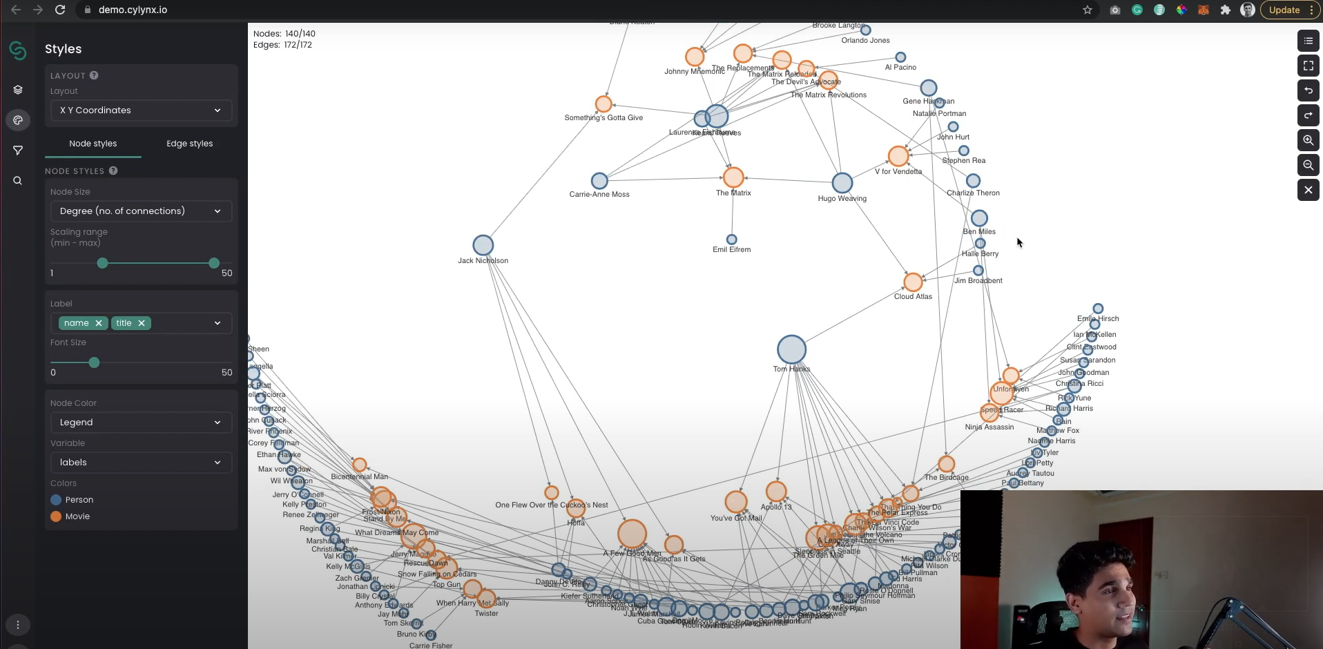
- I was able to answer quick questions by just visually looking at the graph, like who is the most popular actor/movie. If you are interested in knowing the detailed steps you can check out my youtube video Or you can just try it yourself by going to the demo link
A Few Challenges of Graph Data Exploration
- Finding the connection through the tabular form
The tabular representation of our data is quite difficult to understand in some cases. The companies and organizations are working on relational database structures, they prefer to stay within the boundaries of the data.
These boundaries are not assisting the companies to evolve. The implementation of graphical data exploration in the entities will help them understand the relationship in the tabular forms. It will also assist these companies to adopt flexibility and make new research and discoveries in the relevant fields.
- Challenges in data exploration
Finding the connection between different things through graph data may take some time in several situations. This could be challenging for some companies as they don’t have enough time to work on data exploration.
Data scientists and researchers in these situations play a huge role. They can implement new technologies and solutions in the companies to make things easier. Networkx and igrapgh are some of these tools that are used by data scientists.
- Issues with high dimensional data
A graph designed in a real-world scenario may have some edges, nodes, and some different properties that may be challenging for the new users. The users will need some extra time to deal with these graphs and understand the properties.
- Exchanging the results with others is challenging
There are sometimes when you want to share the results with your friends and colleagues. In these situations, the graphical data in tabular form is hard to share with others. There are no special tools for sharing the insights of your graphs like several other technologies.
Conclusion
Cylynx is continuously trying to introduce and implement new tools and software to make things easier. Also providing products and techniques to assist financial fraud authorities in connecting the links among various data pieces.
Graphs are the greatest way to display and handle such information. Motif has been built to make graph finding clear and open to researchers, data analysts, and executives by integrating the demands of our different application releases.